use-case · qa · testing
For QA engineers: workflows that make repros stick
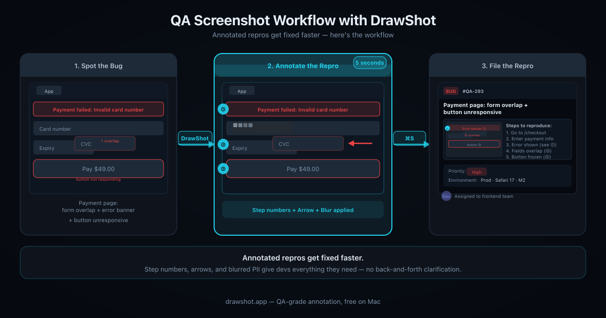
About 40% of bug tickets get an engineer clarification request within the first hour — nearly all asking "wait, what am I looking at?" The fix is one annotation on every screenshot. In DrawShot that's R + ⌘S — five seconds after capture. Here's the full QA workflow.
A QA engineer I interviewed for this post told me her job is "20% finding bugs, 80% convincing engineers the bug is real." That ratio sounds right based on the four other QAs I've talked to.
The bottleneck isn't finding the issue. The bottleneck is the screenshot evidence that turns "this is broken on staging" into "the engineer can see exactly what's wrong without asking three follow-up questions."
This is a writeup of the patterns I've seen QA folks use with DrawShot, plus a few specific to QA work that I've added since.
The standard QA screenshot
Most bug reports filed by QA share the same shape:
- Title: short description of the broken behavior
- Description: steps to repro, expected vs actual, environment notes
- Attached screenshots: the broken state, often with no annotation
The "no annotation" part is the leak. An unannotated screenshot leaves the engineer guessing which of the 12 elements on screen is the bug. Half the back-and-forth in bug triage is "wait, what am I looking at?"
A QA team I worked with measured this: ~40% of bug tickets had an engineer comment asking for clarification of the visual repro within the first hour. That's a real cost, and it's preventable with 5 seconds of annotation.
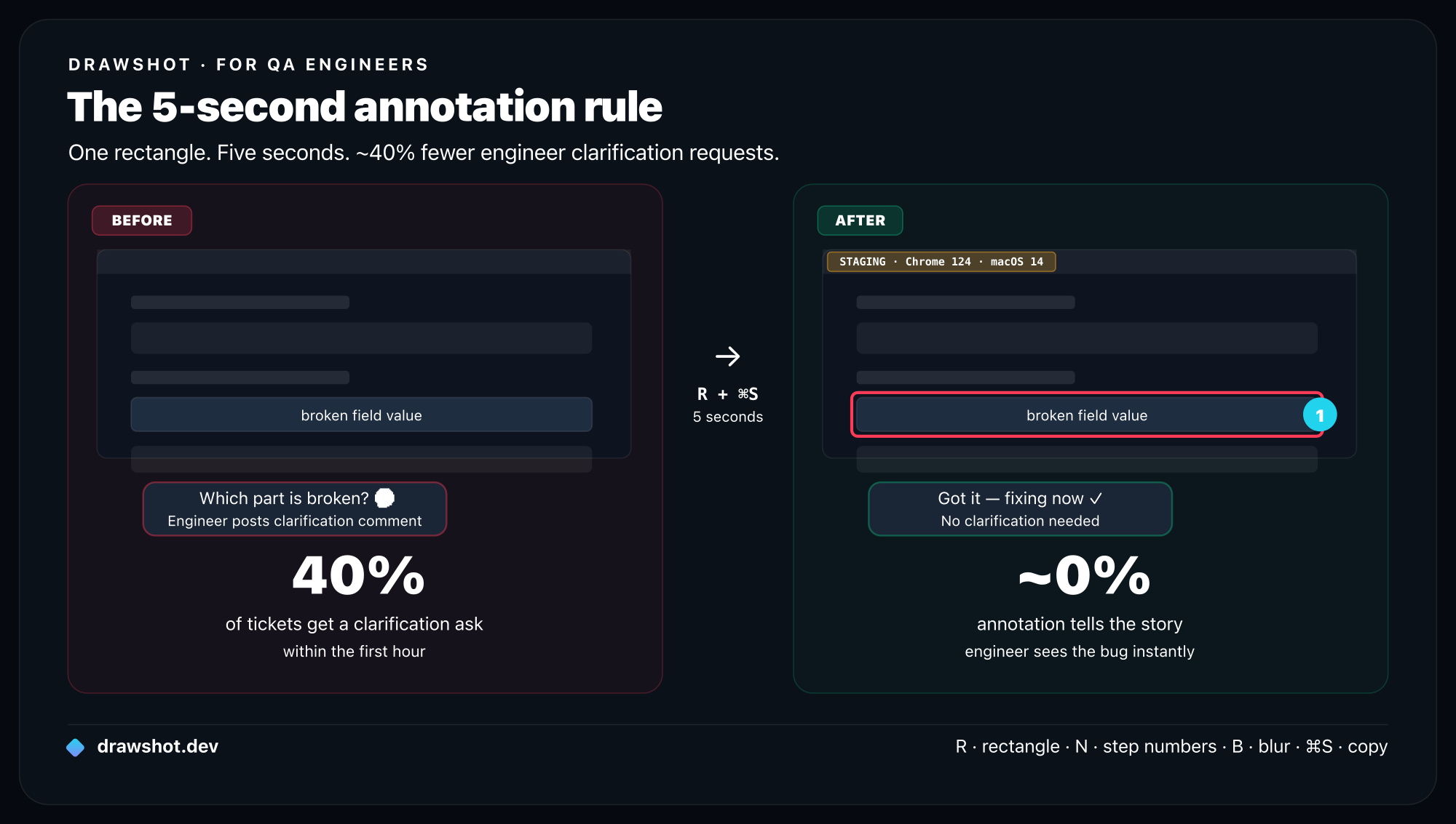
The 5-second annotation policy
What I'd suggest as a baseline:
Every bug ticket has at least one screenshot, and every screenshot has at least one annotation.
That's it. Doesn't have to be pretty. A red rectangle and an arrow is enough.
The rule sounds trivial but it does two things:
- Forces you to look at the screenshot before attaching, which catches "wait, this captured the wrong window" mistakes.
- Tells the engineer "the bug is the thing inside this rectangle" without them having to ask.
In DrawShot, the 5-second annotation is:
⌘⇧4to captureR, drag a rectangle around the bug⌘Sto copy
Five seconds. Two keystrokes after the capture. There's no excuse to skip it.
QA-specific patterns
A few patterns that go beyond general bug reporting.
1. Environment badges
For bugs that are environment-specific (staging only, prod only, certain browser, certain OS), include a small callout (L) in the corner of the capture:
- "STAGING — Chrome 124 — macOS 14"
- "PROD — Safari 17 — iOS 18"
The engineer doesn't have to scroll to your ticket description to know what environment this is. It's in the screenshot.
Set up a Preferences shortcut for "default text color = amber, default position = top-right corner" and this becomes a one-second habit.
2. State markers for multi-step bugs
For bugs that require a sequence of actions to trigger, use step numbers (N) in a single screenshot to show the order:
- Step 1: click this button
- Step 2: open this dropdown
- Step 3: notice the broken state in this region
One image, three numbered markers, easier to follow than a screen recording for many repro types. (For race-condition bugs or animation bugs, screen recording is still better — use ⌘⇧5 for that and attach alongside.)
3. Pixel-perfect annotations for layout bugs
For "the spacing is wrong" or "the element overlaps" bugs:
- Use the line tool (
L) to draw straight rulers showing the misalignment - Hold
Shiftto constrain to perfectly horizontal or vertical - Add a small text caption with the expected vs actual values ("expected 16px, got 12px")
Engineers respond way better to a measurable, specific bug than to "looks weird."
4. Side-by-side comparison captures
For regressions, capture both the working version and the broken version. DrawShot doesn't have a built-in side-by-side tool yet (might in 1.2), but the workaround is:
- Capture both
- Annotate each with a blue rectangle on the working version and a red rectangle on the broken version
- Click the Blue swatch for "this is what should happen"
- Click the Red swatch for "this is what is happening"
- Paste both into the ticket in order
Consistent color coding across your team makes regressions instantly readable.
5. Blur on customer data
QA work often involves real customer data — your tickets reference real account IDs, real names, real emails. Blur tool (B) on every screenshot that has any of these. Make it a non-negotiable.
For higher-stakes bugs (security tickets, GDPR-relevant bugs), Export → "Flatten with redaction" writes solid black pixels instead of blur — no possibility of de-blurring with image manipulation tools.
The toast stack as a debugging trail
One pattern QA engineers I talked to mentioned: when debugging a complex bug, take many screenshots while exploring, then dismiss the ones you don't need at the end.
DrawShot's toast stack is built for this. Example: investigating a payment flow bug. Captures along the way:
- The product page
- The cart with the item added
- The checkout form
- The payment method selection
- The "review order" page
- The error screen
- The Network tab showing the failed API call
- The Console with the error
8 captures, 8 toasts in the stack. By the end, you know the bug is between captures 5 and 6 — so you keep those two, dismiss the other 6 (click ✕ on each), and your ticket has exactly the two screenshots that matter.
The cost of capturing too many is nothing. The cost of capturing too few is going back to reproduce a state you've lost.
Developers use the same capture-stack pattern for filing bug reports — the workflow is identical, the context is different.
Anti-patterns I've seen
A few QA workflow choices that turned out to be wasteful:
Screenshot of the entire monitor. Don't. Capture only the relevant region. Engineers don't want to hunt for the bug in a 2560×1440 image.
Screenshot of just the bug with no surrounding context. Don't. The engineer needs to see what page/screen this is on. Include enough context for orientation, then use a rectangle to highlight the specific element.
Screenshots in random order in the ticket description. Don't. Order them in the order the bug unfolds. Step 1 first, step 2 next. Don't make the engineer re-sequence them mentally.
One screenshot with 12 annotations on different bugs. Don't. One screenshot per bug. If a frame has multiple bugs, file multiple tickets — or list them all in one ticket with separate annotated captures per bug.
What DrawShot doesn't help with
To be honest about boundaries:
- Video bugs / animation bugs. Stills can't show timing. Use
⌘⇧5(native macOS) or Kap (free) for short clips. DrawShot doesn't record video. - Cross-device repros. If a bug only happens on iPhone, you need iPhone screenshots, not Mac ones. DrawShot is Mac-only.
- Automated testing screenshots. If you're running headless tests that need screenshot output, use Playwright / Cypress built-in screenshot tools. DrawShot is for human-driven repros.
A small idea I'd love to see
If you're a QA team lead reading this: institute a "5-second annotation" policy on bug tickets. Measure the bug-triage clarification rate before and after. I'd bet it drops by 25%+ within a month.
The cost of adopting it is one tool install per engineer and a one-line policy update. The savings compound across every bug ticket your team files.
Frequently asked questions
How should QA engineers annotate bug report screenshots? Every screenshot needs at least one annotation — a red rectangle around the broken element is enough. In DrawShot: ⌘⇧4 to capture, R to draw the rectangle, ⌘S to copy. Five seconds. This alone eliminates ~40% of the "wait, which element is broken?" clarification requests engineers leave within the first hour.
How do I document a multi-step bug with screenshots? Use step numbers (key N in DrawShot) on a single capture showing the interaction sequence, then add a second capture of the broken end state with a red rectangle. Two annotated screenshots beats a six-step text description every time and drops "I couldn't repro it" follow-ups.
How do I redact customer data in QA bug screenshots? DrawShot's Blur tool (key B) covers names, emails, and account IDs in two seconds. For security tickets or GDPR-relevant bugs, use Export → "Flatten with redaction" — that writes solid black pixels to disk so the original data never makes it into the file.
Download DrawShot — free — no account, no telemetry, macOS 13+.
— Shraddha
drawshot.dev · v1.0 · macOS 13+ · free
— Shraddha Mittal
Related reading