design · ux · craft
Designing the toast stack
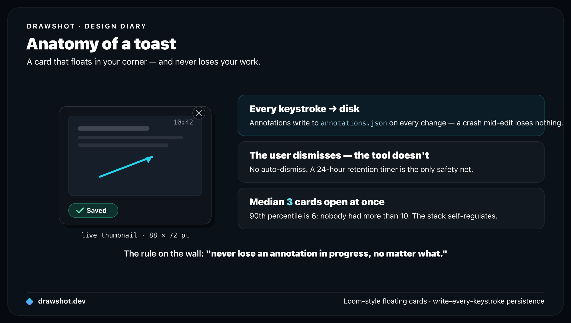
DrawShot's toast stack is the row of cards that float in your corner after a capture. It's built around one rule — never lose an annotation in progress — using a Loom-style floating-card pattern backed by write-every-keystroke persistence, so a crash mid-edit loses nothing.
The toast stack is the row of small annotation cards that float at the bottom-right corner of your screen after you take a capture. It's the part of DrawShot I'm most proud of — and it took the longest to get right.
This post is the design diary of that feature, from a vague intuition to the shipped version.
The starting problem
In user research, the same anecdote came up in 5 of the 7 interviews:
"I took a screenshot, started annotating it, switched to Slack to check a teammate's name, and when I came back the annotation window was gone. I had to start over."
Different tools, same outcome. Sometimes the user hit Esc by accident. Sometimes the app crashed. Sometimes alt-tab pulled the editor behind another window and they thought it was gone. The shared experience: work that lived only in the editor window was fragile, and losing it was common enough to be a defining frustration with capture tools.
I wrote the constraint down on the wall:
The user should never lose an annotation in progress, no matter what they do.
Everything about the toast stack flows from that one sentence.
The first attempt: a window
The intuitive solution is: don't let the annotation window go away. Pin it on top, prevent closing, etc.
This is what some tools do. It's actively bad. It puts the annotation tool in a fighter-for-attention contest with the user's actual work. Slack needs focus. The annotation window is now an obstacle, not a tool.
I tried it for two days. Hated it. Cut it.
The second attempt: the file system
Maybe the right pattern is just "save the file immediately." Every capture writes to disk, and if you switch away, the file is still there on Desktop or in ~/Pictures/DrawShot/.
I tried this for a day. It also failed, for two reasons:
- The Desktop is already a graveyard. Adding another file every time someone captured was going to make a bad situation worse (see the screenshots-aren't-files post for the data on this).
- Files don't communicate "in-flight." A file on Desktop looks the same as a file from yesterday. The user has to remember "I was annotating this." That cognitive load is exactly what I was trying to remove.
The right pattern was somewhere between "transient window" and "permanent file" — an artifact that's visible on your screen but not in your way.
The Loom analogy
The breakthrough was watching someone use Loom for a few minutes. Loom records a video clip; after recording, the clip floats as a small thumbnail in the corner of the screen. You can click it to expand. You can ignore it. It just sits there, available, until you dismiss it.
It's a UI pattern that:
- Doesn't fight for focus
- Stays visible across app switches
- Has a clear dismissal gesture
- Implies transient (the artifact will eventually go away)
This was the right primitive for screenshots too. I started prototyping.
The first prototype
A single floating card, bottom-right corner of the screen. Showed a thumbnail of the most recent capture. Click to re-open the annotation canvas.
Tested it for a week in my own workflow. It worked, but with one issue: what about the previous capture?
If I take screenshot A, switch to Slack to send it, then take screenshot B before Slack is done loading — screenshot A's toast vanishes the moment B replaces it. Now I've lost A.
The answer was obvious in hindsight: not a single toast, but a stack. Each capture floats independently. They scroll horizontally as the stack fills.
What does the card look like
Lots of iteration here. The shipped version:
- 88 × 72 pt card, scaled down to ~80% of the capture's aspect ratio
- Capture thumbnail with any annotations overlaid (the thumbnail re-renders when the user makes a change in the canvas)
- Capture timestamp in the top-right (
10:42) - Small ✕ button that appears on hover for dismissal
- Optional ✓ saved badge if the user has pressed
⌘S - Subtle drop shadow (Y=4, blur=12, opacity=15%) so the cards lift off whatever's behind them
What I cut:
- A "filename" label below the thumbnail (didn't help; the thumbnail is enough)
- A favicon-style indicator of the destination app (couldn't reliably detect)
- A right-click context menu (added discoverability cost without much value)
- Animation flourishes on hover (felt clever in isolation, felt twitchy in actual use)
The animation matters
A toast appears when a capture completes. The animation is:
- The card starts ~32pt below the bottom of the screen, fully transparent.
- Over 180ms, it slides up and fades in (
easeOutCubic). - If there are other toasts already, they slide left by the width of the new card + 8pt gap.
180ms is short enough to feel responsive, long enough that your eye tracks the motion. I tried 80ms (felt jarring) and 320ms (felt slow). Don't trust me — try the test build with different values; you'll feel which is right.
In beta 0.8.0, I shipped without the animation — just a static appear. Three of nine testers reported in week 2 that they "hadn't noticed the toast existed" until I pointed it out. The animation isn't decoration; it's a wayfinding signal.
Persistence is the unsexy half
The visible toast stack is the front half of the feature. The back half — the part that makes the constraint "the user should never lose an annotation" actually true — is the persistence layer.
The model:
~/Library/Application Support/DrawShot/sessions/2026-05-15-104207/
├── original.png          ← raw capture, never modified
├── annotations.json      ← annotation state, updated on every change
└── rendered.png          ← cached flat merge for fast toast thumbnails
Every annotation action — every keystroke in a text label, every nudge of an arrow's endpoint — writes to annotations.json. The toast thumbnail re-renders from the json. If DrawShot crashes mid-edit, on next launch the session folder is detected and the toast repopulates exactly where you left off.
The cost: a few KB of I/O per second under active editing. The benefit: I can crash the app at any moment and lose nothing.
I had a beta tester try to break this. He had three captures open, was annotating one, and force-quit the app from Activity Monitor. Relaunch: all three toasts back, annotation in progress preserved on the active one. He emailed me to say it was the first time he'd ever trusted a screenshot tool with work-in-progress. That email is on my wall.
Dismissal is hard
When does a toast go away?
The shipped rules:
- Click the ✕ — toast disappears immediately, but the session folder stays for 24 hours in case it was a misclick.
- Quitting DrawShot — toasts come back on next launch.
- Crash — toasts come back on next launch.
- The 24-hour retention timer expires — session folder is deleted.
What I tried and cut:
- Auto-dismiss after copy — annoyed me within a day, because "I just copied this, I'd like the option to recapture with a different annotation" is a common workflow.
- Auto-dismiss after 10 minutes — also annoying, for similar reasons.
- Auto-dismiss when more than 8 toasts — almost the right idea, but felt arbitrary. Instead, after ~8 toasts the stack scrolls horizontally and the older ones become slightly translucent (a visual hint that they're stale without forcing dismissal).
The principle: the user dismisses. The tool doesn't. Two exceptions: the 24-hour retention timer (mostly to keep ~/Library/Application Support/DrawShot/ from growing unbounded), and an opt-in "auto-dismiss after save" toggle in Preferences for users who want it.
The number that surprised me
Six weeks after the feature shipped to beta, I asked testers how many active toasts they had at any one time.
Median: 3. The 90th percentile was 6. Nobody had more than 10.
I'd been worried about the stack getting visually overwhelming with 15+ cards. In practice, the natural workflow keeps you between 1 and 5. The dismissal pattern self-regulates: people dismiss when they're done with a thread, which is most of the time.
So the horizontal scrolling I built? Probably overkill. I'll leave it in — but I'm not going to build the "compact mode" I was considering. The actual problem doesn't exist.
Why I'm proud of this feature
It's a small idea. A row of cards at the corner of your screen. There's no novel algorithm, no AI, no patent-worthy invention.
But it solves a real, specific problem — losing in-flight annotation work — that every capture tool has, and that no capture tool I tried before building DrawShot had solved well. It does so with a pattern people already know (Loom-style floating artifacts), backed by an architecture (write-every-keystroke persistence) that makes the constraint a guarantee, not a hope.
Design at its best is finding the existing pattern that fits the problem, then implementing it carefully enough that users don't have to think about it. The toast stack is that, I think.
Frequently asked questions
What is DrawShot's toast stack? It's the row of small cards that float in the bottom-right corner of your screen after each capture. Each shows a live thumbnail with its annotations, persists across app switches and crashes, and reopens the annotation canvas exactly where you left off when you click it.
How does DrawShot avoid losing an annotation in progress? Every annotation action writes to disk immediately — annotations.json updates on every keystroke, not on save. If the app crashes mid-edit, the session folder is detected on next launch and the toast repopulates exactly where you left off. "Never lose an annotation in progress" becomes a guarantee, not a hope.
When does a toast disappear? The user dismisses it — the tool doesn't. Click the ✕ and the card goes away, though the session folder is kept for 24 hours in case it was a misclick. There's no forced auto-dismiss; an opt-in "auto-dismiss after save" toggle is there for those who want it.
Download DrawShot — free — macOS 13+, no account.
— Shraddha
drawshot.dev · v1.0 · macOS 13+ · free
— Shraddha Mittal
Related reading