how-to · backgrounds · pro
How to Add a Background to a Screenshot on Mac
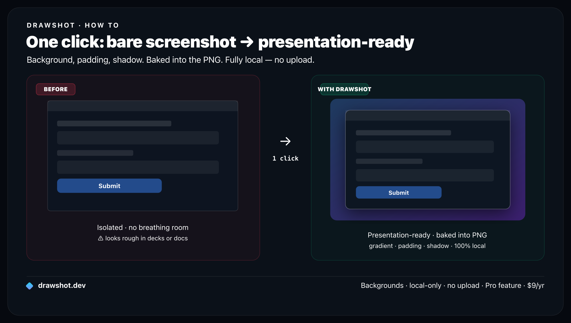
TL;DR: To add a background to a screenshot on Mac, you style it like a product shot: drop it on a background colour or gradient, add padding so it floats, round the corners, and add a soft drop shadow, then export. The popular tools that do this — BrandBird, Pika, ScreenCharm, Screenhance — are mostly web uploaders: you send your screenshot to their server, style it, and download. That's fine for a marketing shot; it's not what you want for internal UI or customer data. DrawShot's coming Backgrounds & Mockups feature does the same styling locally inside the app — size/aspect presets, background colours, padding, corner radius, and shadow, all baked into the exported PNG with no upload.
A raw screenshot is honest and ugly. Hard pixel edges, the wrong shape for wherever it's going, zero separation from the slide or the tweet behind it. The instant you put it in a deck, a changelog, a landing page, or a launch post, it screams "I pasted this in a hurry." Styling it — a background, some padding, rounded corners, a shadow — is the difference between a screenshot and something that looks designed.
Here's how to do that on a Mac: what the styling actually consists of, what the free web beautifiers get you (and their one catch), and a local, in-workflow way that's coming to DrawShot.
What "add a background" actually means
"Beautifying" a screenshot is four small moves stacked together. Each one does a specific job:
- Padding — space between your screenshot and the edge of the image. This is the single biggest upgrade: it gives the shot a margin instead of bleeding to the border, so it reads as a framed object.
- Background — a solid colour, a gradient, or an image filling that padding. It's what your shot now floats on.
- Corner radius — rounding the screenshot's corners (~12–20px) so it looks like a modern UI card, not a hard rectangle.
- Shadow — a soft drop shadow that lifts the shot off the background, adding depth so it doesn't look pasted flat.
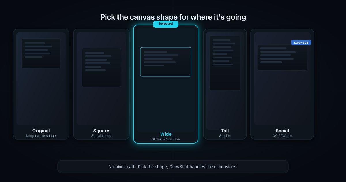
Optionally, a device or window frame (a browser chrome, a MacBook bezel) wraps the shot for extra context. And a size/aspect preset reshapes the whole canvas — square for social, wide for slides — so it fits the destination without you doing pixel math.
That's the entire recipe. Every "stunning screenshot" you've seen in a launch post is some combination of those.
The popular way: web beautifiers
Search "screenshot beautifier" and the first page is web tools — BrandBird, Pika, ScreenCharm, Screenhance, and a dozen more. The flow is identical across all of them:
- Upload your screenshot to the site.
- Pick a background (gradient or solid), set padding (8–12% is the common advice), choose a frame (macOS / browser), set corner radius (~20), add a shadow (blur ~60, opacity ~40).
- Download the result.
They're genuinely good, often free, and if you style one screenshot a month, open one and move on. No notes.
The catch: you're uploading your screenshot to someone else's server. For a marketing shot of your public homepage, that's nothing. For a screenshot of an internal dashboard, a customer's account, an unreleased feature, or anything with data in frame, you've just handed a copy to a third party to make it pretty. That's a strange trade for "I wanted rounded corners." And it's a context switch every time — capture on your Mac, jump to a browser tab, upload, fiddle, download, come back. For anything internal, it's the same reason DrawShot is built local-only.
The local alternative: style it where you captured it
The fix isn't "don't style screenshots." It's "don't leave your Mac to do it." A native app can do every one of those four moves locally — the pixels never go anywhere — and it can do them in the same place you already captured and annotated, instead of a separate browser tab.
That's what Backgrounds & Mockups is in DrawShot — one of the Pro features coming soon. It turns a raw shot into a presentable one without an upload and without leaving the editor:
- Size & aspect presets — Original, Square, Wide, Tall, Social. Pick the shape for where it's going (Square for a feed, Wide for a deck) and the canvas reshapes; no guessing dimensions.
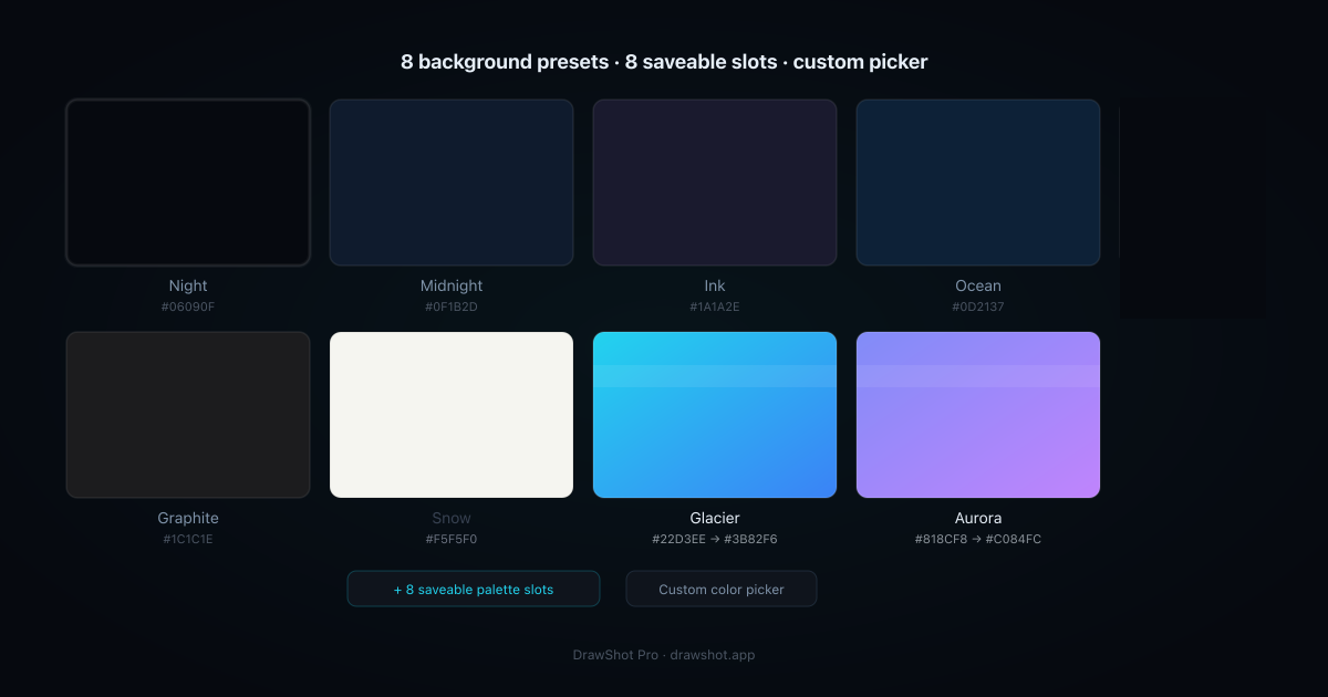
- Background colours — 8 presets, plus 8 saveable palette slots so your team's brand colours are one click away, plus a custom picker for anything else.
- Padding — dial in the breathing room around the shot.
- Corner radius — round the screenshot's corners to taste.
- Shadow — a soft drop shadow to lift it off the background.
- Baked into the export — every bit of that styling is flattened into the exported PNG. What you see is exactly the file you share — no layered project, no "looks right in the editor, wrong everywhere else."
Because it lives in the app you already capture and annotate in, the styling step joins the same loop: capture with ⌘⇧4, mark it up, add a background, export. No browser tab, no upload, no round trip.
Straight on the honesty, since it's coming-soon: Backgrounds & Mockups ships in the Pro tier ($9/year — about $0.75/month), which is on the way, not live today. The free core — capture, 11 annotation tools, blur, ⌘S save-and-copy — is available now, and it's the right thing to install first so the styling drops into a workflow you already run. (DrawShot's free tier includes basic backgrounds; the full preset/palette/mockup system is the Pro upgrade.)
A few styling rules that actually help
Whatever tool you use, these are the settings that separate "styled" from "overdone":
- Padding is the cheat code. If you do exactly one thing, add padding. ~8–12% of the image width. It does more for "looks designed" than any other single setting.
- Match the size preset to the destination. Square for most social, Wide (16:9) for slides and thumbnails, Tall for stories, Original when you just want padding without reshaping.
- Keep the shadow soft and the radius modest. A heavy black shadow or a 40px radius looks like a 2014 app icon. Soft, low-opacity shadow; ~12–20px corners.
- Pick a background that doesn't fight the UI. A calm gradient or a brand solid. If your screenshot is already colourful, go quieter behind it.
- Save your brand colours once. If you ship screenshots regularly, the saveable palette slots mean you're not re-entering the same hex code every time.
Frequently asked questions
How do I add a background to a screenshot on Mac? Upload the screenshot to a screenshot beautifier, pick a background colour or gradient, add padding so the shot floats inside it, round the corners (~12–20px), and add a soft drop shadow, then export. Most popular beautifiers are web tools, so you upload the image to their server. DrawShot's coming Backgrounds & Mockups feature does the same styling locally inside the app — presets for size and background, padding, corner radius, and shadow, all baked into the exported PNG without an upload.
Why do my screenshots look bad in slides and on social? A raw screenshot is the wrong shape and has no breathing room — hard edges butt against the slide, the aspect ratio doesn't fit the frame, and there's no separation from the page behind it. Adding padding, a background colour, rounded corners, and a soft shadow gives the shot a margin and lifts it off the surface, which is why product screenshots in decks and on social are almost always styled this way.
Is there a free way to beautify a screenshot without uploading it? Yes — a native Mac app that styles screenshots locally never uploads your image. Most of the popular "screenshot beautifier" sites are web tools that process the shot on their server, which you may not want for internal UI or customer data. A local app keeps the pixels on your Mac while still giving you backgrounds, padding, corner radius, and shadow.
What background size should I export a screenshot at? Match the destination. Square (1:1) for most social feeds, Wide (16:9) for slide decks and YouTube thumbnails, Tall for stories and vertical posts, or Original to just add padding without changing the aspect ratio. Presets save you from guessing pixel dimensions — pick the shape for where it's going and export.
A good screenshot shouldn't require a browser tab and an upload.
Backgrounds & Mockups is coming to DrawShot Pro — size presets, background palettes, padding, corner radius, and shadow, all baked into the export locally. $9/year. Be first to know when it ships.
Get on the Pro list →Or download the free annotator now — capture, annotate, blur, ⌘S save-and-copy. Backgrounds lands on top when Pro ships.
— Shraddha
Backgrounds & Mockups lands in DrawShot Pro — $9/year, styled locally with no upload. Start with the free core and we'll ping you when it ships.
— Shraddha Mittal
Related reading